Thursday 30 June 2011


I was in the mood to try out some different techniques on how to paint human flesh. I wanted Belial to have a sundered, ashen appearance, as if he has spent to to much time on board a star ship. I wanted to highlight any indentation on his face and draw attention to the characters venerable status. 

The three sergeants faces were worked up from Tallarn Flesh using only VMC Glacier Blue. The purple undertone in the Glacier blue interacts wonderfully with the red present in the Tallarn flesh. It's a great little combination, one I highly suggest you investigate for yourself.

LilLoser

Wednesday 29 June 2011


I was contacted to create a Dark Elf regiment off the back of the work I am doing on my own Druchii host.

After lengthy discussion about the nature of Dark Elves and those of Karond Kar, we decided upon a few design principles and I went off to sculpt these for him. These soldiers will form the corner stone of a much larger commission to create a grand war-host of Karond Kar; perfect timing!

LilLoser

Tuesday 28 June 2011


Third unit in under a week; I haven't painted this quickly since I was in school. I have a 5 dark reapers, a farseer, 4 warlocks and the Phoenix lords to tackle by Sunday. I don't think I'll manage to paint the Lords in time. They are great sculpts and deserve time to be enjoyed while painting. But I feel pretty confident about completing the rest.

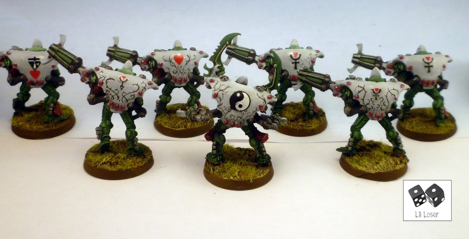
I really hated painting these warp spiders. There are so many tiny rubies, weird tassels to cover up the join between the eldar and the gun, and the gun itself is incredibly unwieldily. I added decals from the falcon kit to their backs and added a little free hand to break up the large flat surface. 

Did Jes Godwin sculpt these? They weren't pleasurable to paint like the other models in the Eldar range and i'm struggling to reconcile the same man who created the awesome Dark Eldar range created these. It didn't help that my friend gleefully texted me this morning: "So I'll have to pay you a lot more to do 21 more of them?"

Monday 27 June 2011


Part 2 of my £30.00 army commission for my long suffering friend. I've managed to paint two units within a week to a reasonable standard using the grey scaling technique; it really is the future of quality mass painting.

Special shout out to Martin, my tenth follower. Thank you all for adding me to your subscription lists, I appreciate the following.

Friday 24 June 2011


I'm painting up my very good friend's army for him. Time and money is an issue here, so I offered to paint the lot for thirty quid and a **** job by the end of this month. I've managed to get off to a great start finishing off the Banshees using the grey scaling technique. I couldn't resist adding a few flourishes like the ying and yang symbols and the hand painted hearts on the helmets.


Workbench 24.Jun.2011:

[Commission] Dante Chapter Master of the Blood Angels
[Commission] Sanguinius, Primarch of the Blood Angels
Converted Talos
[Commission] The Sanguinor
[Commission] Farseer and Warlock retinue
[Commission] Dark Reapers
[Commission] Fire Dragons
[Commission] Warp Spiders


Mostly Commission work here this week, but plenty of fun painting one of my favourite ranges of miniatures (shame they all weren't Jes Godwin's sculpts)

LilLoser

Thursday 23 June 2011


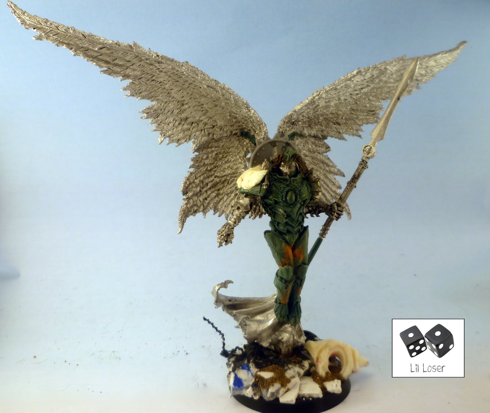
This is a commission piece for a client who requested that no expense should be spared creating Sanguinius, the Lord of the Blood Angels. I have been working at it for some months now and feel that it is in good enough condition to release as a W.I.P shot. 

I still need to sculpt feathers, ornamentation of the armour and a fur pelt prevelent in the artwork for Sangunius. 


Here is a scale comparison shot to show just how awesome this thing looks next to normal warhammer miniatures.


LilLoser

Monday 20 June 2011


Here is the current state of my weekend deathwing project. I have added classic chapter markings (Rogue Trader decals) to the models and added battle damage to the armour.


I've decided to paint the sheath's of the guns grey instead of the traditional green or red. When Xyon first suggested this I dismissed the idea too quickly. I thought that the models would look quite dull and monotone. However, painting the sheath's in green or red really draws the eye away from the main model. By keeping the sheaths neutral I can develop colour sigils on the model itself.

Ultimately, I was finally swayed by this;


Here are some close ups detailing the battle damage done on the models and the rogue trader chapter symbol.


Thursday 16 June 2011


Cold one knights have been a favorite of mine since I started collecting wargaming figurines. Whenever I field my Dark Elves, I always make sure my lord is accompanied by his own retinue of knights. I just had to include these in my revamped army. Here is the first mock up of the cold one knight.


I've gathered an eclectic mix of bits from across Games Workshop's range to produce what I envision my Cold One Regiment should look like. I knew as soon as I saw the new Incubi and dark eldar kabailte warrior kits that they would be perfect to create these arrogant killers. I wanted each knight to have a personal banner that incorporates the motif of the bloody heart and his own trophy rack. Since my army is constantly moving through the chaos wastes, coupled with the cold ones stocky build, I only thought it natural that these nobles would display their trophies in such a way. 

I'm still undecided whether or not to use the bigger metal shield on all my knights, or whether to modify the plastic shields that come with the kit. I plan on using the classic bloody heart motif across the unit, sculpting it on armour and painting it on the individual banners.


I quite like how the smaller plastic shield shows off more of the model, but the older metal shield has a lot of nostalgic value locked up in it. If I cannot successfully re-create Rakarth's shield (I imagine they would be too expensive to buy) I'll be forced to use my second option.


LilLoser

Wednesday 15 June 2011


If you're interested in miniature photography, then undoubtably you would have come across the term 'light box'. A light box diffuses an external light source to make colours appear more like they do in real life in photographs. They are quite inexpensive to find online, but you can make your own quite cheaply. However, for the true lazy ass, there is an alternative.

Get yourself to your local Wilkinsons and buy a small bin with a semi transparent frosted finish (I bought mine for 60p). Next, saw a rectangle from the bin and place a sheet of paper within it as backing (see below). And that's it! Ideally, you will want to have three light sources shining on your model (I only had two) and light the model through the frosted exterior; don't shine the light directly onto the model. 


By simply cropping and enchanting this photo, you have the perfect photography set up to snap your own models. All for under a pound (if you don't include the price of the camera, lights, bulbs and model that is)!


LilLoser

Tuesday 14 June 2011


Here is my second spear elf. By this rate I should have the entire unit painted up in thirty years!


Friday 10 June 2011


I've decided that I want my Talos to look quite subservient, with lots of hanging chains and trohpies. I imagine that my Haemonculous would use this Talos as a mix of personal assistant (for heavy lifting and gashing) and trophy cabinet. 


I've magnetised the base to the Talos because it's a little front heavy. 


Tuesday 7 June 2011


I’m a sucker for the old school. I like reading fluff from before I started collecting (some of it is before I was even born). I hoard details in text like I horde possessions; it’s something in every one of our natures – the compulsion to horde, categorize, contextualise, and fixate upon. I do the same with images, and models. Writing OOP after a model listing for ebay will quadruple the amount of viewers you have on an item guaranteed. However, after years of lusting after the models of my youth, the reality of owning these models can be a bit of a let down. Older models, especially from the eighties are often a lot smaller and thinner than their contemporary counterparts. So, what is important when modelling is to recreate the archetype of the model. 

The word archetype incorporates the Greek word arche, meaning origin or source, and it’s meaning derives from Plato’s idealist philosophy of perfect forms. Plato theorized that all physical objects have a perfect form that exists outside of our physical reality, and all physical matter is moving toward replicating this perfect idealistic form. So all apples, are in effect, an imitation of the perfect, archetypal apple. 

If your still reading, you may be wondering, ‘what the hell has Plato got to do with collecting a chaos force?’ Well, like hoarding OOP fluff, I horde images. By saturating my consciousness with images of what I think comprises Chaos , I can begin to independently formulate the look of my army. I can create and convert the army to closer resemble that perfect ‘other’ of chaos that exists on the metaphysical plane of human consciousness… yeah even I think I’m stretching it with that last statement. 

Images of Hell.

I’ve been compiling images for a while now, so nearly all of these images (models and art) go unaccredited. Sorry for this, but I mostly use Google and coolminiornot.com, as well as old rulebooks and white dwarf articles for reference. I doubt there is an image here that cannot take five minis to find in a good search engine. 

I want to start off my comparing two images, and explain the difference between, what I feel is, an archetypal image, and an illustration. 

Archetype 

John Blanche:


A name I think we are all familiar with, love him or loathe him, Blanche has a very distinct style that has helped established the visual world of Warhammer. Below are sampling for the conceptual sketches done for the Vampire Counts project. Although not originally planned for general release or public viewing, they none-the-less reveal some interesting facets of the GW think tank. 

I remember reading an article in White Dwarf, where Jervis Johnson was explaining how the GW team goes about designing a new army. For starters, these images aim to generate archetypal images, they don’t have to be finely detailed, draughtsman like images: in fact, the looser the better. This argument follows a line of art criticism that is beautifully illustrated in Scott Mc Cloud’s, Understanding Comics, and can be found here: 

http://scottmccloud.com/4-inventions...gle/index.html

The illustration above falls somewhere between the cartoon, and the abstract, on The Big Triangle; an image that we can impress our interpretation onto, and interpret. I will refer to this method of viewing an image as reading it. 

Illistration:


First of all, a definition: Illustration, noun; a picture that complements text, a provision of pictures accompanying text, something that helps explain something. I think the majority of us can agree, that the above image is pretty damn cool. Perspective is spot on, light sourcing, movement, and detail, all compact into what is a recognisable Chaos warrior. However, what we gain in clarity, we lose in interpretation. We cannot ‘read’ the image with as much personal input as we can a John Blanche picture. It is an image that was designed to illustrate, not necessarily inspire. 

I couldn’t find out who made this image, but I suspect that it was generated as promotional fluff for Warhammer: Age of Reckoning, the video game. If this is the case (and please correct me if I am wrong), the artist has done a superb job of distilling the messy conceptual detail that is seen in Blanche’s work, producing an image that is illustrative of all chaos warriors. He has presented the viewer with a typical chaos warrior, not an archetypal one. 

So what are Chaos warriors? What is the perfect vision of that archetypal chaos warrior look like? That depends, person to person, but I think this image comes closest to my ideal: 


This armour looks Grecian, or, perhaps, it would be fairer to say, the armour is based on classical designs. The word classical is a fairly broad term for ancient civilised cultures such as the Romans, Greeks, Mongols etc. If Salvador Dali had designed Greek armour, I believe it would look something like this; albeit without the massive helm that would have undoubtedly looked like a phallus. 

So, I have a rough reference point. I’m also going to use Ian Miller (look him up through Google, you’ll know who I mean). It’s good to draw inspiration from fantasy artists, but it’s even better to go to the source of their inspirations. Below, I have put a link to another photobucket file full of images that I will use as reference for the imagery of the army. Since The chaos realms would figure at the top-most pinnacle of McCloud’s Big Triangle, it seems appropriate to draw from surrealist artists, as well as the work produced in the Renaissance, which always inform GW imagery. 

The Gates of Hell by Auguste Rodin


Here's a wiki link about it: 

http://en.wikipedia.org/wiki/The_Gates_of_Hell 

Images of torture and damnation are, I think, wholly appropriate to the Chaos theme. I'll have a go at sculpting details depicted on Rodin's The gates of Hell into the armour of my warriors. I'm planning on including some big guys in my force, giving me lots area's where I can sculpt armour and personalize. 

Here's a link to my photobucket page of reference (check out the Flesh hounds chucking up blood):

http://s751.photobucket.com/albums/x...rence/?start=0


There is another batch of images I have drawn upon heavily for the manufacture of my models, but I want to keep these a secret until I can post up some WIP shots. Must warn you though, this secrecy of mine is the kind of secrecy used in Dan Brown books; its an obvious scam to keep you reading until the end of the book, and you think it wasn’t even that good of a secret anyway.

Monday 6 June 2011


I’m a sucker for the old school. I like reading fluff from before I started collecting (some of it is before I was even born). I hoard details in text like I horde possessions; it’s something in every one of our natures – the compulsion to horde, categorize, contextualise, and fixate upon. I do the same with images, and models. Writing OOP after a model listing for ebay will quadruple the amount of viewers you have on an item guaranteed. However, after years of lusting after the models of my youth, the reality of owning these models can be a bit of a let down. Older models, especially from the eighties are often a lot smaller and thinner than their contemporary counterparts. So, what is important when modelling is to recreate the archetype of the model.

The word archetype incorporates the Greek word arche, meaning origin or source, and it’s meaning derives from Plato’s idealist philosophy of perfect forms. Plato theorized that all physical objects have a perfect form that exists outside of our physical reality, and all physical matter is moving toward replicating this perfect idealistic form. So all apples, are in effect, an imitation of the perfect, archetypal apple.

If your still reading, you may be wondering, ‘what the hell has Plato got to do with collecting a chaos force?’ Well, like hoarding OOP fluff, I horde images. By saturating my consciousness with images of what I think comprises Chaos , I can begin to independently formulate the look of my army. I can create and convert the army to closer resemble that perfect ‘other’ of chaos that exists on the metaphysical plane of human consciousness… yeah even I think I’m stretching it with that last statement.

[b][u]Images of Hell.[/u][/b]

I’ve been compiling images for a while now, so nearly all of these images (models and art) go unaccredited. Sorry for this, but I mostly use Google and coolminiornot.com, as well as old rulebooks and white dwarf articles for reference. I doubt there is an image here that cannot take five minis to find in a good search engine.

I want to start off my comparing two images, and explain the difference between, what I feel is, an archetypal image, and an illustration.

[u][b]Archetype[/b] [/u]

John Blanche:

[IMG]http://i751.photobucket.com/albums/xx159/lilizzyloser2008/Chaos%20army%20refference/John_Blanche_Strigoi-1.jpg[/IMG]

A name I think we are all familiar with, love him or loathe him, Blanche has a very distinct style that has helped established the visual world of Warhammer. Below are sampling for the conceptual sketches done for the Vampire Counts project. Although not originally planned for general release or public viewing, they none-the-less reveal some interesting facets of the GW think tank.

I remember reading an article in White Dwarf, where Jervis Johnson was explaining how the GW team goes about designing a new army. For starters, these images aim to generate archetypal images, they don’t have to be finely detailed, draughtsman like images: in fact, the looser the better. This argument follows a line of art criticism that is beautifully illustrated in Scott Mc Cloud’s, Understanding Comics, and can be found here:

[url]http://scottmccloud.com/4-inventions/triangle/index.html[/url]

The illustration above falls somewhere between the cartoon, and the abstract, on The Big Triangle; an image that we can impress our interpretation onto, and interpret. I will refer to this method of viewing an image as reading it.
Illistration:

[IMG]http://i751.photobucket.com/albums/xx159/lilizzyloser2008/Chaos%20army%20refference/600full-warhammer--mark-of-chaos-ar.jpg[/IMG]

First of all, a definition: Illustration, noun; a picture that complements text, a provision of pictures accompanying text, something that helps explain something. I think the majority of us can agree, that the above image is pretty damn cool. Perspective is spot on, light sourcing, movement, and detail, all compact into what is a recognisable Chaos warrior. However, what we gain in clarity, we lose in interpretation.  We cannot ‘read’ the image with as much personal input as we can a John Blanche picture. It is an image that was designed to illustrate, not necessarily inspire.

I couldn’t find out who made this image, but I suspect that it was generated as promotional fluff for Warhammer: Age of Reckoning, the video game. If this is the case (and please correct me if I am wrong), the artist has done a superb job of distilling the messy conceptual detail that is seen in Blanche’s work, producing an image that is illustrative of all chaos warriors. He has presented the viewer with a typical chaos warrior, not an archetypal one.

 So what are Chaos warriors? What is the perfect vision of that archetypal chaos warrior look like? That depends, person to person, but I think this image comes closest to my ideal:

[IMG]http://i751.photobucket.com/albums/xx159/lilizzyloser2008/Chaos%20army%20refference/image-1.jpg[/IMG]

This armour looks Grecian, or, perhaps, it would be fairer to say, the armour is based on classical designs. The word classical is a fairly broad term for ancient civilised cultures such as the Romans, Greeks, Mongols etc. If Salvador Dali had designed Greek armour, I believe it would look something like this; albeit without the massive helm that would have undoubtedly looked like a phallus.

So, I have a rough reference point. I’m also going to use Ian Miller (look him up through Google, you’ll know who I mean). It’s good to draw inspiration from fantasy artists, but it’s even better to go to the source of their inspirations. Below, I have put a link to another photobucket file full of images that I will use as reference for the imagery of the army. Since The chaos realms would figure at the top-most pinnacle of McCloud’s Big Triangle, it seems appropriate to draw from surrealist artists, as well as the work produced in the Renaissance, which always inform GW imagery.

[u][b]The Gates of Hell by Auguste Rodin[/b][/u]

[IMG]http://i751.photobucket.com/albums/xx159/lilizzyloser2008/Chaos%20army%20refference/hell.jpg[/IMG]

Here's a wiki link about it:

[url]http://en.wikipedia.org/wiki/The_Gates_of_Hell[/url]

Images of torture and damnation are, I think, wholly appropriate to the Chaos theme. I'll have a go at sculpting details depicted on Rodin's The gates of Hell into the armour of my warriors. I'm planning on including some big guys in my force, giving me lots area's where I can sculpt armour and personalize.

Here's a link to my photobucket page of reference (check out the Flesh hounds chucking up blood):

[url]http://s751.photobucket.com/albums/xx159/lilizzyloser2008/Chaos%20army%20refference/?start=0[/url]


There is another batch of images I have drawn upon heavily for the manufacture of my models, but I want to keep these a secret until I can post up some WIP shots. Must warn you though, this secrecy of mine is the kind of secrecy used in Dan Brown books; its an obvious scam to keep you reading until the end of the book, and you think it wasn’t even that good of a secret anyway.